Size
~5kb.min.js
Themes
Infinite
Dependencies
0
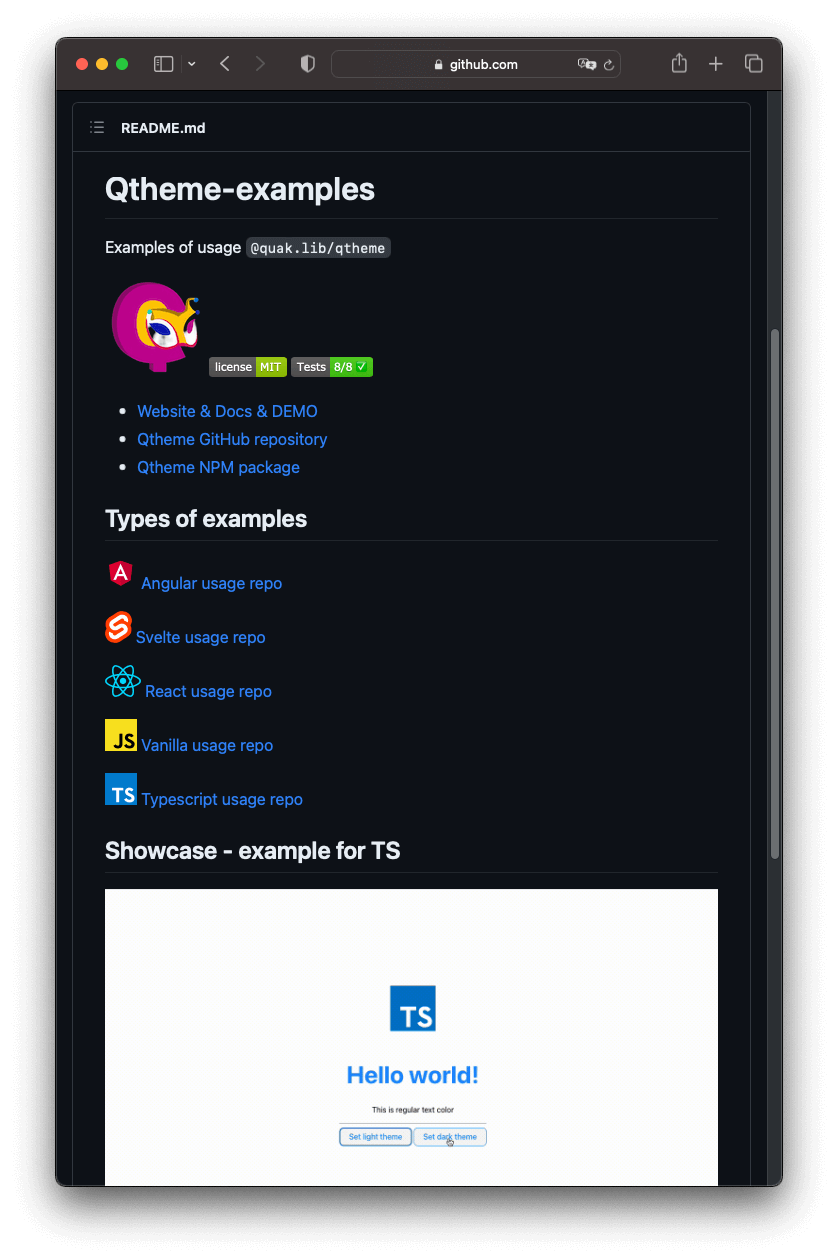
Example theme usage in HTML
bg-accent text-accent-content
Install
Install package from NPM
npm install @quak.lib/qtheme
Declare Themes
Example Theme snippets
1 const darkTheme = {
2 name: 'dark',
3 atoms: [
4 ['bg', '#333'],
4 ['bg-inner', '#555'],
5 ['text', 'white'],
6
7 ['primary', 'rgb(147,99,219)'],
8 ['primary-inner', 'rgb(39 21 77)'],
9 ['primary-focus', 'rgb(69,47,103)'],
10 ['primary-content', 'white'],
11
12 ['bg-color', 'background-color:var(--bg)'],
13 ['text-color', 'color:var(--text)'],
14 ['text-primary', 'color:var(--primary)']
15 // ...
16 ]
17 }
Use directly in HTML
Atom in markup usage
Take a look how to utilize your theme atoms
1 <body class="bg-color text-color">
2 <h1 class="text-primary">Primary heading</h1>
3 <p>Regular paragraph</p>
4
5 <!-- compound atoms below -->
6 <button class="btn">btn</button>
7 <button class="btn-primary">btn-primary</button>
8 </body>
2 <h1 class="text-primary">Primary heading</h1>
3 <p>Regular paragraph</p>
4
5 <!-- compound atoms below -->
6 <button class="btn">btn</button>
7 <button class="btn-primary">btn-primary</button>
8 </body>
Compound Atoms
Create atoms like btn or btn-accent from multiple CSS properties to create this special design you needIntelisense
Import CSSProps for hints inside your IDE
import {CSSProps} from '@quak.lib/qtheme'
Declare compound atoms
Example button atoms snippets
1 // Example result
2 const btn: CSSProps = {
5 backgroundColor: 'var(--primary-inner)',
6 outlineColor: 'var(--primary-focus)',
7 border: '1.5px solid var(--primary)',
8 borderRadius: '0.25rem 0.5rem'
9 }
10
11 const btnHover: CSSProps = {
12 backgroundColor: 'var(--primary)'
13 color: 'var(--primary-content)'
14 cursor: 'pointer'
15 }
16
17 const btnAtoms: ThemeAtom[] = [
18 ['btn', btn],
19 ['btn:hover', btnHover]
20 ]
2 const btn: CSSProps = {
3 padd|
4 color: 'var(--primary)',- Ppadding ... string | number | "inherit" | ...
- PpaddingLeft string | number | "inherit" | ...
- PpaddingBottom string | number | "inherit" ...
- PpaddingTop string | number | "inherit" | u...
- PpaddingRight string | number | "inherit" |...
- PscrollPadding string | number | "auto" | "...
- P...10 more...
5 backgroundColor: 'var(--primary-inner)',
6 outlineColor: 'var(--primary-focus)',
7 border: '1.5px solid var(--primary)',
8 borderRadius: '0.25rem 0.5rem'
9 }
10
11 const btnHover: CSSProps = {
12 backgroundColor: 'var(--primary)'
13 color: 'var(--primary-content)'
14 cursor: 'pointer'
15 }
16
17 const btnAtoms: ThemeAtom[] = [
18 ['btn', btn],
19 ['btn:hover', btnHover]
20 ]
Simply - init your theme
Initialize atoms to use them globally across your app
1 import {Qtheme} from "@quak.lib/qtheme"
2
3 // * will load theme from localStorage else darkTheme
4 Qtheme.init(darkTheme)
2
3 // * will load theme from localStorage else darkTheme
4 Qtheme.init(darkTheme)
Change theme
Change theme freely to any you have created
1 // * will save theme to localStorage
2 Qtheme.setTheme(lightTheme)
2 Qtheme.setTheme(lightTheme)
Set common atoms
Use common atoms across multiple themes and make theming even simpler
1 const atoms = [
2 ...btnAtoms,
3 ...btnPrimaryAtoms
4 ]
5 Qtheme.setCommonAtoms(atoms)
6 // or with init method
7 // * will load commonAtoms from localStorage else atoms
8 Qtheme.init(darkTheme, {commonAtoms: atoms})
2 ...btnAtoms,
3 ...btnPrimaryAtoms
4 ]
5 Qtheme.setCommonAtoms(atoms)
6 // or with init method
7 // * will load commonAtoms from localStorage else atoms
8 Qtheme.init(darkTheme, {commonAtoms: atoms})
Atoms-usage in CSS
Since atoms are global use them in CSS
1 .your-class {
2 border: 1px solid var(--primary);
3 background: var(--primary-inner);
4 color: var(--primary-content);
5 }
2 border: 1px solid var(--primary);
3 background: var(--primary-inner);
4 color: var(--primary-content);
5 }